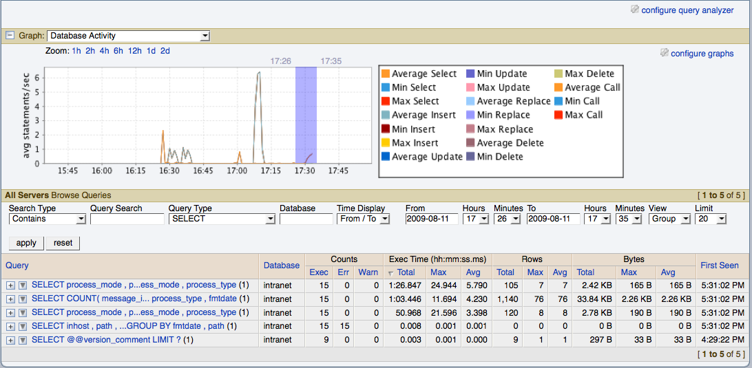
The MySQL Enterprise Dashboard supports correlated graphs so that you can compare the graphed execution parameters, such as the server load, thread statistics, or RAM usage, against the queries that were being executed by the server or servers being monitored at that time.
You can use the correlated graphs in two different ways:
By dragging and selecting an area on a graph as displayed within the Monitor over view tab, or the Graphs tab of the MySQL Enterprise Dashboard. When using either of these two tabs, you can drag and select any region on a displayed graph, and the display will change to the Query Analyzer tab, displaying the corresponding zoomed graph, and the associated queries being executed during the selected period.
You can select a graph to be displayed within the Query Analyzer tab. Open the Graph section, and use the popup list to select the graph to be displayed. You can see an example of this in Figure 9.7, “MySQL Enterprise Dashboard: Correlated Graphs”.
When using the correlated graphs, selecting an area within the graph will set the start and end time within the query filtering selection. You can combine with other filtering options, such as the Query Type, to zero-in on the queries that you want to examine.
To use the graphs in this manner, select a starting point and click, while holding down the button, drag a selection area to set the time-range for the query display. The time range that you have selected will be displayed above the graph as you select the area.
You can also explicitly zoom in an out of the displayed graph by using the links next to the Zoom label. You can select to show just an hour of the graph material, or larger ranges up to two days. At all times, the area on the graph highlighted in blue is the actual date/time range selected within the list of analyzed queries.
For more information on filtering your queries, see Section 9.4, “Filtering Query Analyzer Data”.

